From Stairs to Sections: Plight of the Elderly and Users with Limited Literacy in navigating Contemporary Banking
- Shraddha Mishra
- Aug 17, 2025
- 5 min read
Overview
This is a Case Study of UCO mBanking Plus Application usage among real customers based on testing and analysis in the time frame of 1 year (2024). The project includes feedback from a wide range of customers, including digitally and situationally challenged individuals.
Goal
Ideation of a user friendly interface design for the regular users of the mobile application.
Role
User Experience Designer
Tools used
Figma, Canva
Key Deliverables :
UX Audit
User Flow Diagrams
Wireframes and Prototypes
Design System and Component Library
UCO Bank is a Government of India Public Sector Undertaking founded in 1943, headquartered in Kolkata, and operates with 43 Zonal Offices spread all over India and two International Financial Centers in Hong Kong and Singapore. It boasts of a robust Capital Base, a high proportion of Long Term Liabilities, and a diversified Asset Portfolio. With this extensive country-wide and overseas presence and a large and diversified client base, and all branches integrated under Core Banking Solution(CBS), it is crucial to mark a strong presence on the Digital Platforms too, so as to cater to the "instant" needs of every demographic.
At present, the Bank has 2 significant mobile applications for the masses, UCO mBanking Plus App for Savings Account Customers and UCO Corporate mBanking App for Current Account holders. During my stint in the Bank as a Front-desk executive, one of my roles was to understand and expand the customer base on Digital mediums. I had a daily interaction with over 100 customers and groups from all walks of life, and it helped me deeply analyze the gaps between a real User and Application Developer. Here, my lessons of around 1 year, and my insights on developing a more User-friendly Financial Application are illustrated and summarized as a User Case Study Portfolio Project.
Research & Strategy:
Discovering the Case Study of UCO mBanking Plus App
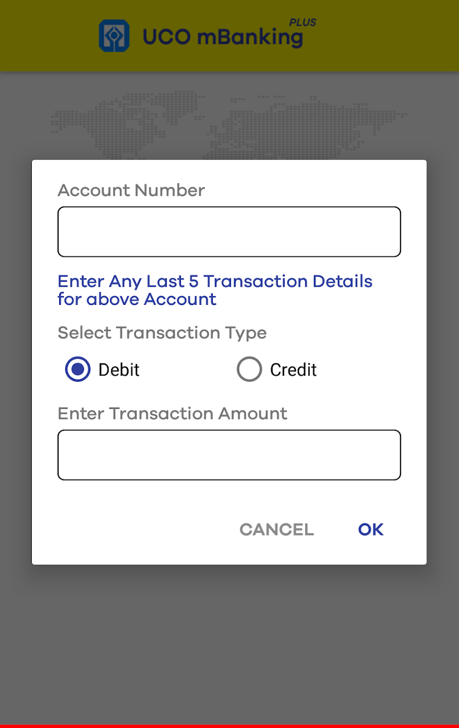
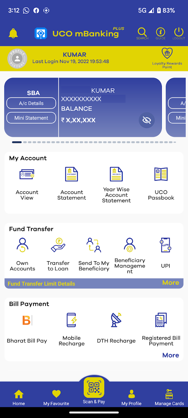
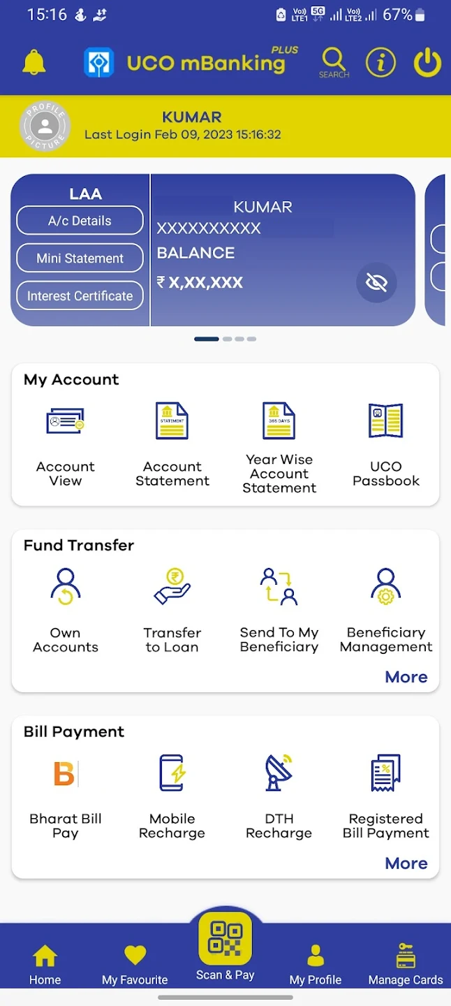
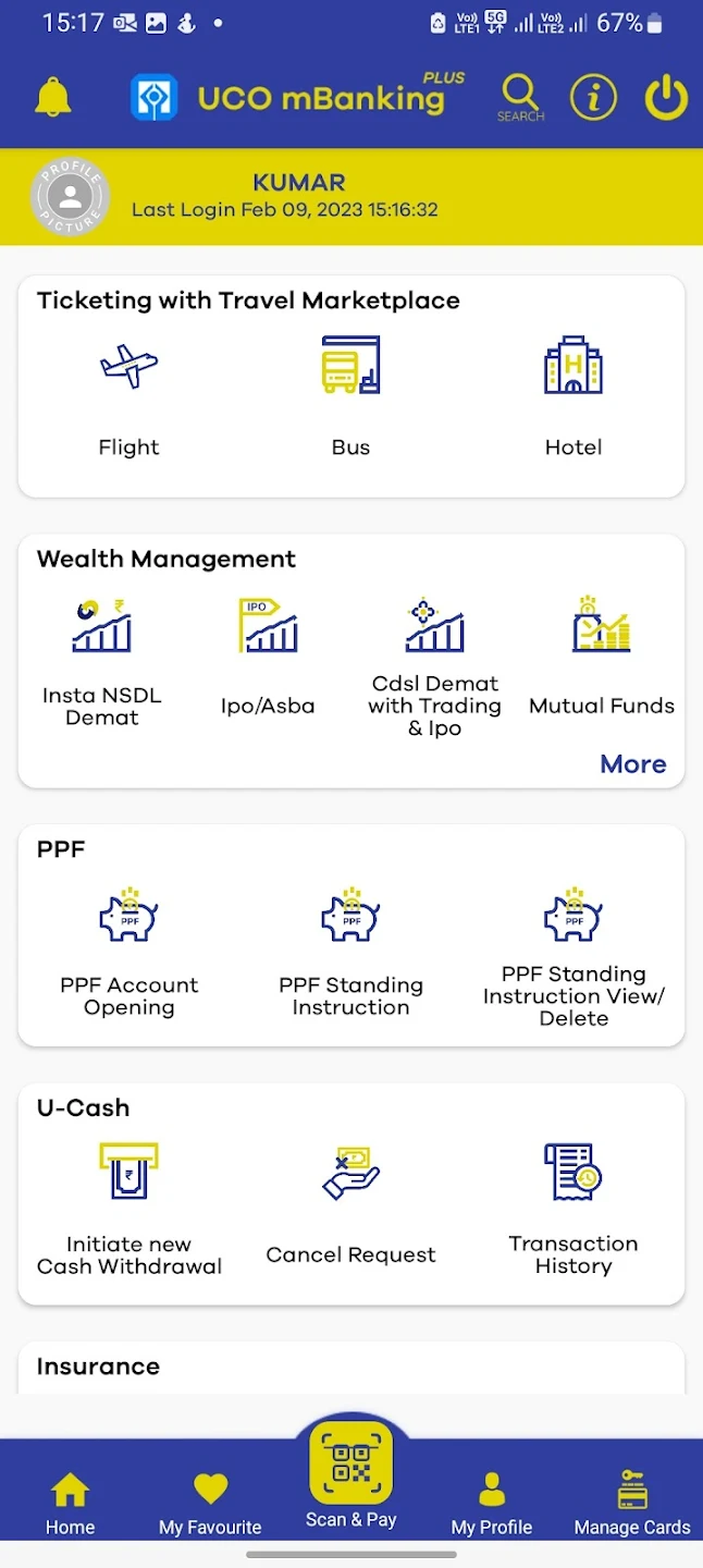
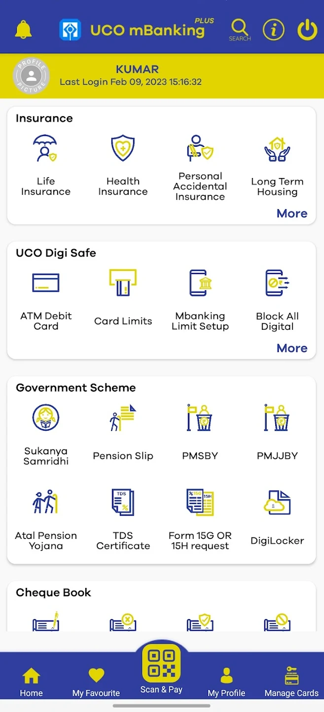
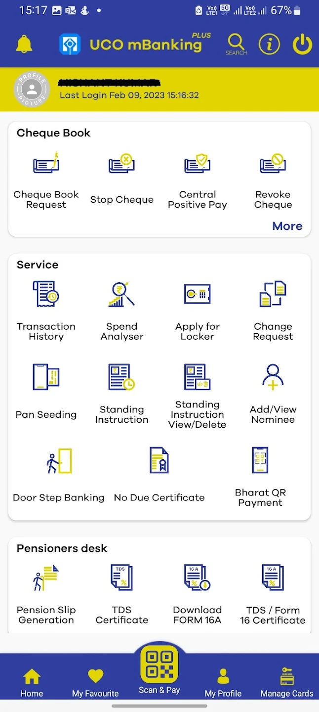
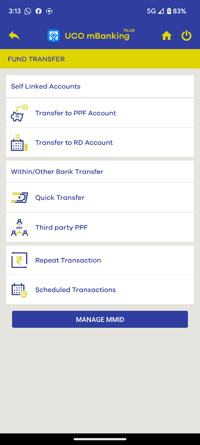
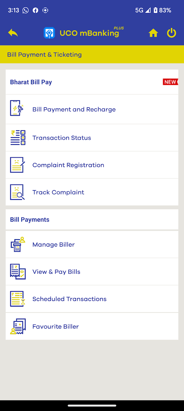
Screenshots of UCO mBanking Plus App, Source: Google Playstore
Here are a few snapshots of the UCO mBanking Plus App taken from the Google Playstore. The interface uses a simple, icon-based layout that allows navigation through button clicks as well as menu scrolling. The comprehensive list of options cover most needs of a User online, within the purview of safety and security commitments provided by the Bank.
Who are the Users?
This study broadly categorizes Customers from UCO Bank across rural and urban contexts, who may/may not be Financially and/or Digitally Literate, but nevertheless, are a part of this study, since they participate on various Digital platforms for their Social/ Financial interactions . We desire to enable their smoother adoption of UCO mBanking Plus App for their daily transactions.

The Opportunities and Challenges
We target to achieve Financial Inclusion, but we must also consider the age and stage of the customer when we desire to induct them into Digital Banking. At a certain point, in order to confirm Banking with Confidence, we reach a threshold due to design constraints like Cognitive overload and absence of Case-dependent Accessibility platforms. We can also identify from the above graph that presence of competitive third-party apps may give the Users a better and customized experience, and they deter our offline loyal Customers from being Core Users of our App.
General Emotions of Users towards the Application

User Personas
User Journey Map

Defining and Narrowing down the Problem
Diving into the 5-why's

Deriving the Problem Statement
"Users need a minimalist & accessible interface in order to complete their routine transactions & banking functions without getting overwhelmed."
Information Architecture
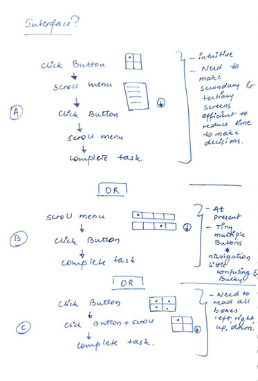
Revising the design to make it ergonomic was not enough, we also needed to look into the daily needs of a User in order to understand the chronology of functions. The Business goals also needed to be accounted for in order to maintain balance. Here, based on my experiences on the front-desk, I pondered over the 21 pre-existing menus, keeping myself in the shoes of the Customer behaving as an App User, and walked through each menu with a different life situation, like a different story, and tried to comprehend the psychology of the User. It is to be noted here that I have not accounted for highest click-rates of every button, as that data was not accessible to me, although it would have been a good starting point in analyzing the design.
Feature prioritization and roadmap


Navigation system design

Wireframes & Prototypes


The prototypes can be viewed in detail here: https://www.figma.com/design/T2PPBqape1toKSknWb7wXI/UCO-mBanking-plus?node-id=0-1&t=XkM87H1fgl2T7S1O-1
Reflections

We started our journey by empathizing with our Customer base. Not everyone is blessed with a great vision, & hiccups do arise even in our normal digital handling. A Bank which tries to provide every possible feature is always favored by a Customer. But when our plate gets full with plenty of eatables, we might succumb to Decision Fatigue. A similar situation is faced by the Users of Mobile Banking applications. And hence, a light interface saves lots of effort on their end. As they rightly say, sometimes less is more in life!!
Inspirations
Here is a very interesting Article on building Financial Applications by Nielson Norman Group, which served as an anchor and inspiration to this Project: https://www.nngroup.com/articles/vanguard-mobile-app/
Another one of my favorites is this Article from the same source, which discusses why clarity of thoughts is a precursor to efficient decision making. This article has a huge influence on the criticality of this Project's problem statement: https://www.nngroup.com/articles/sludge-decisions/




Comments